Freelance Graphic Design
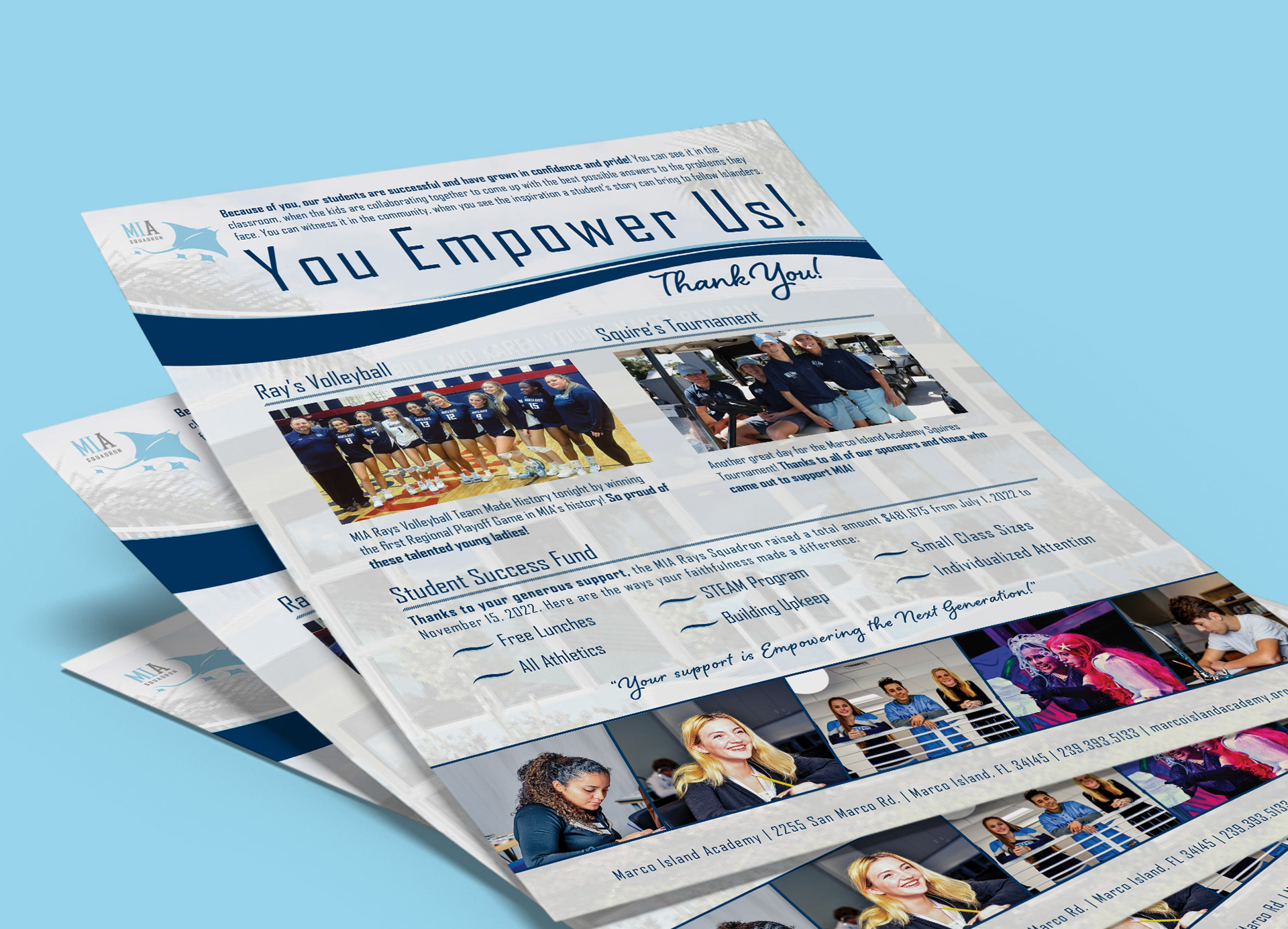
Marco Island Academy Flyer
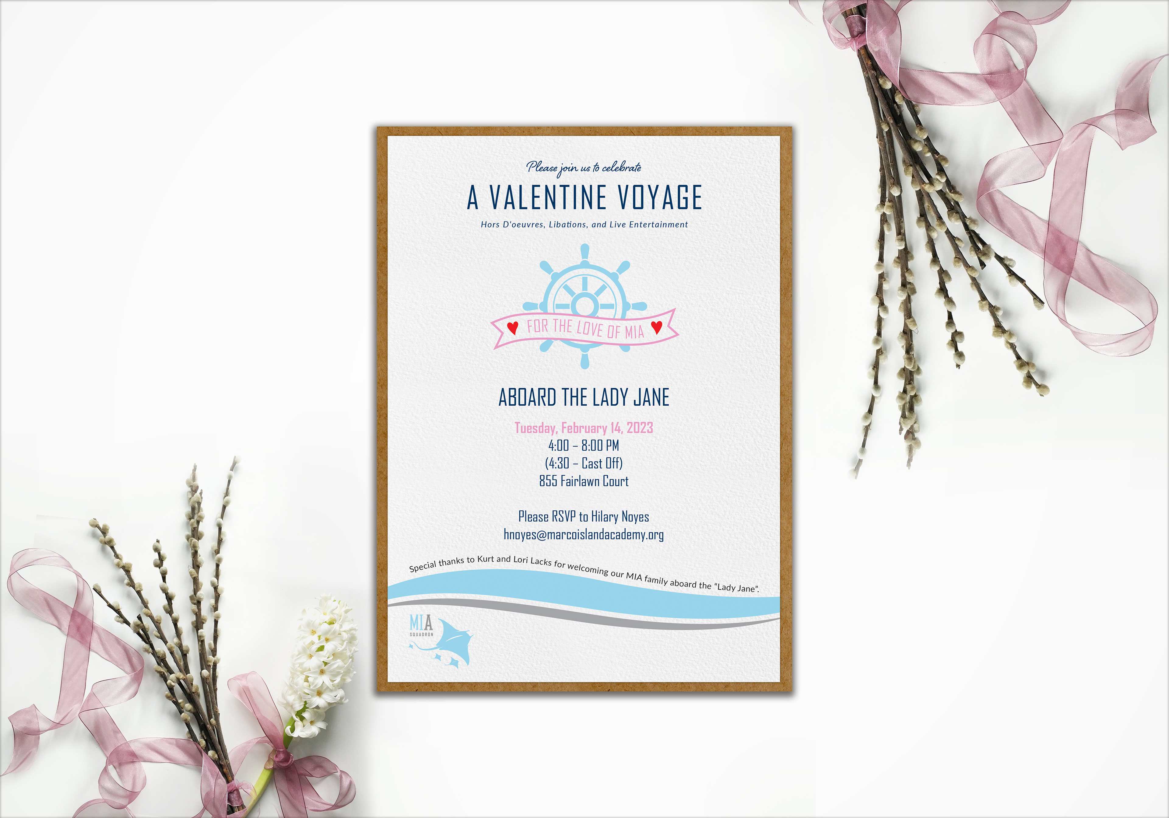
Marco Island Academy Invitation
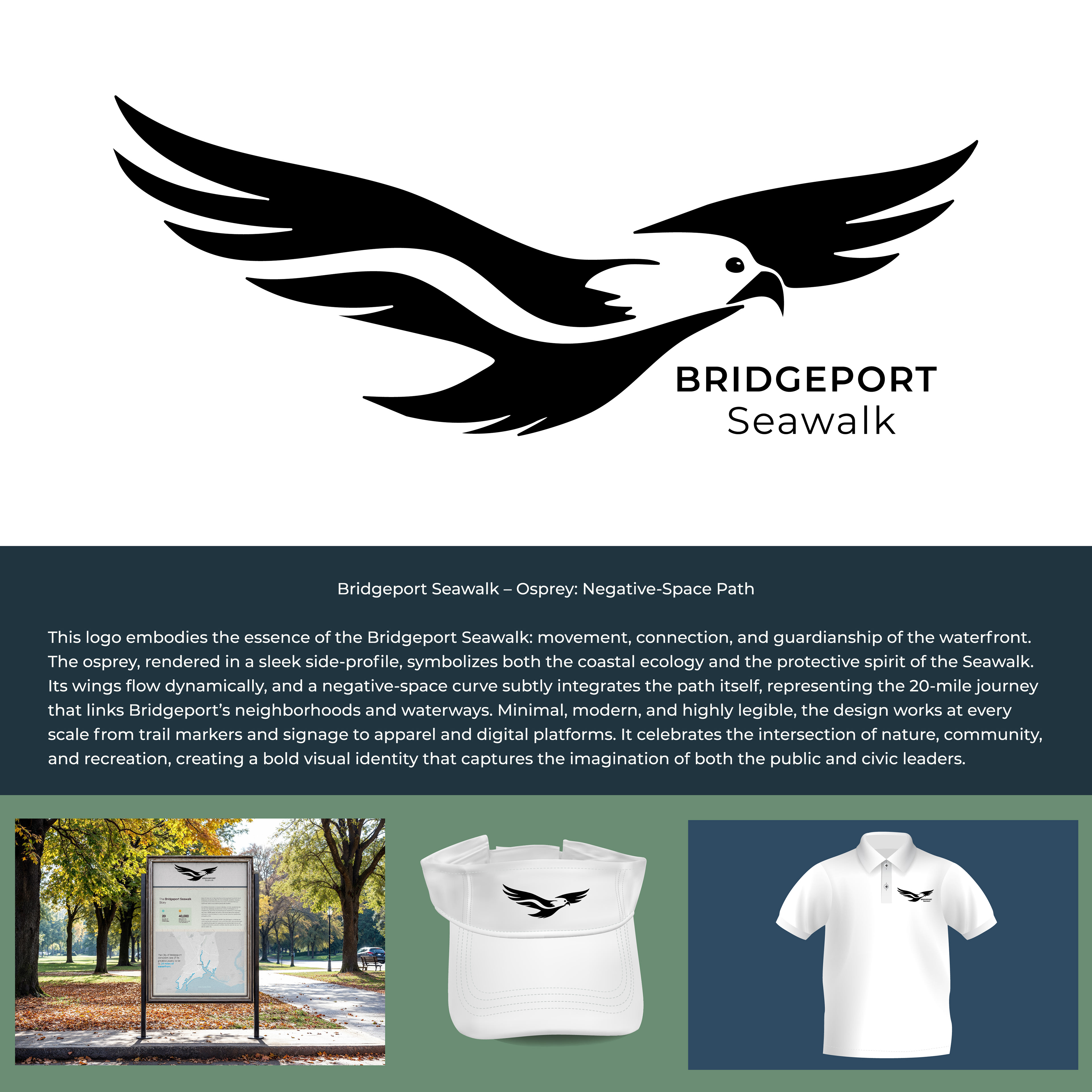
Bridgeport Seawalk Logo Contest
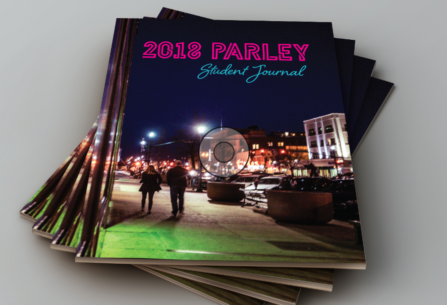
2019 American Advertising Award Winner-Publication
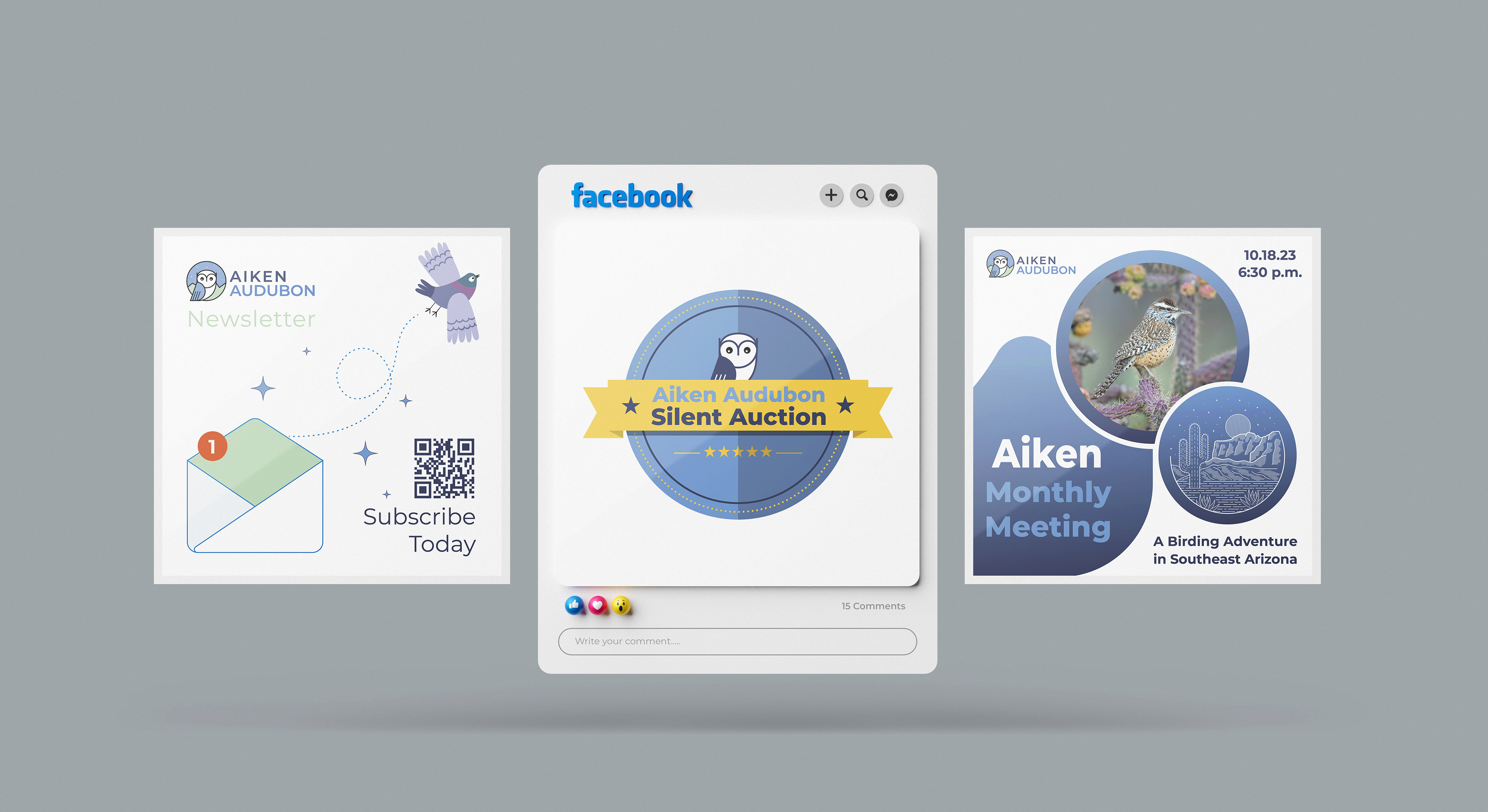
Aiken Audubon Social Media Posts
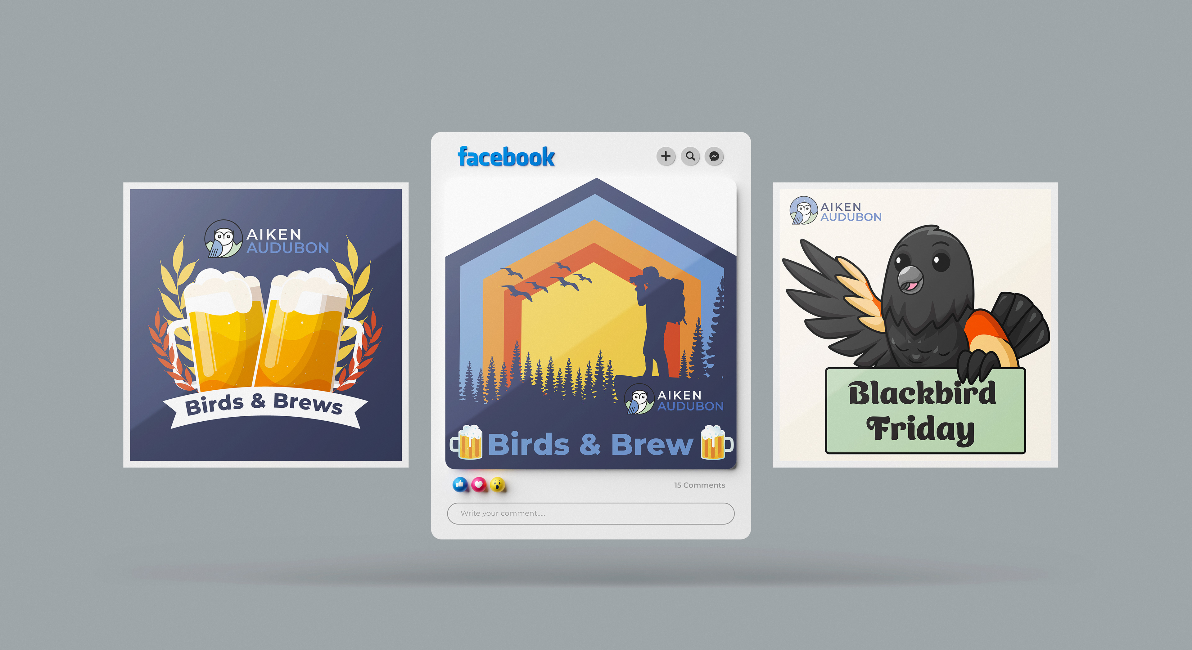
Aiken Audubon Social Media Posts
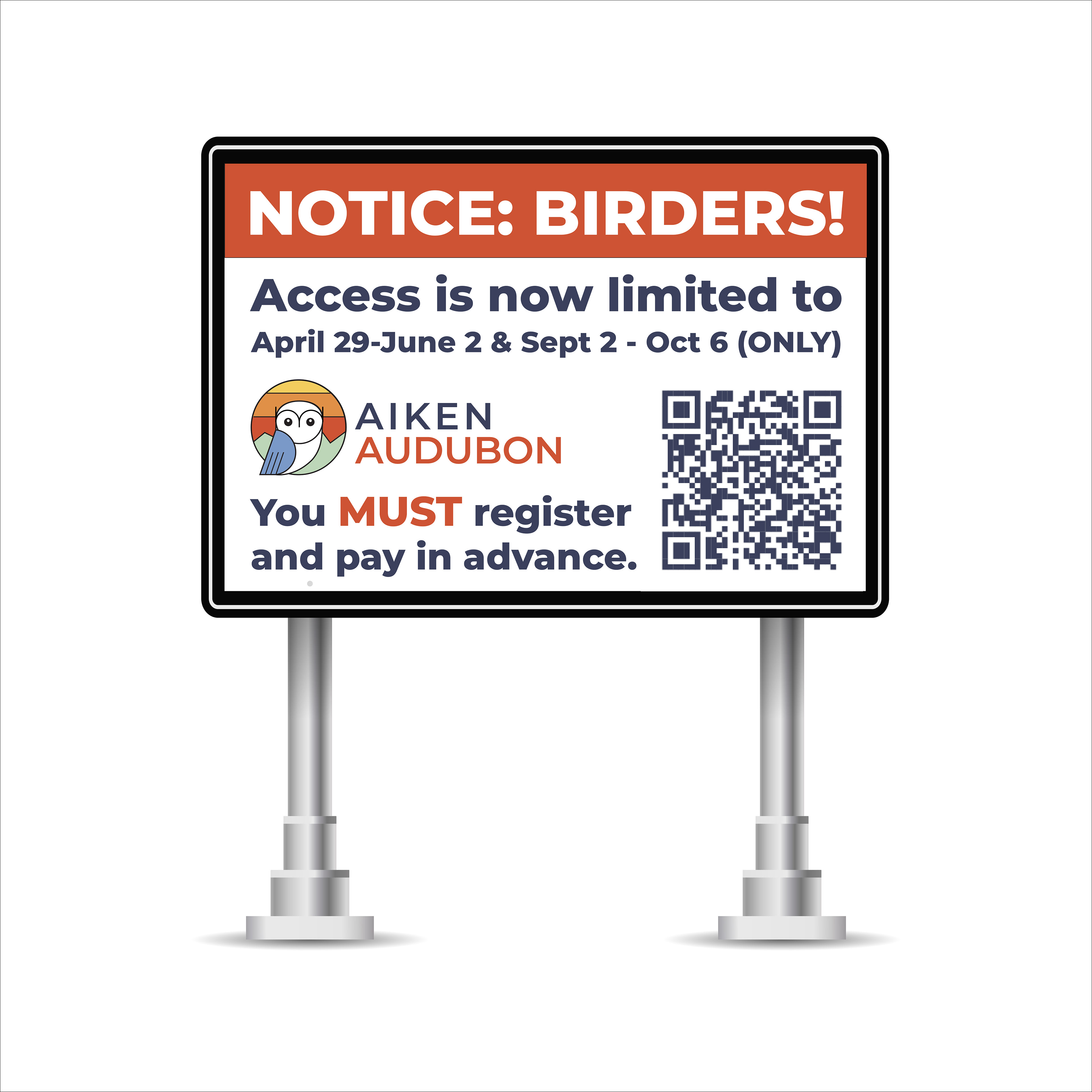
Aiken Audubon | Chico Basin Ranch Signage
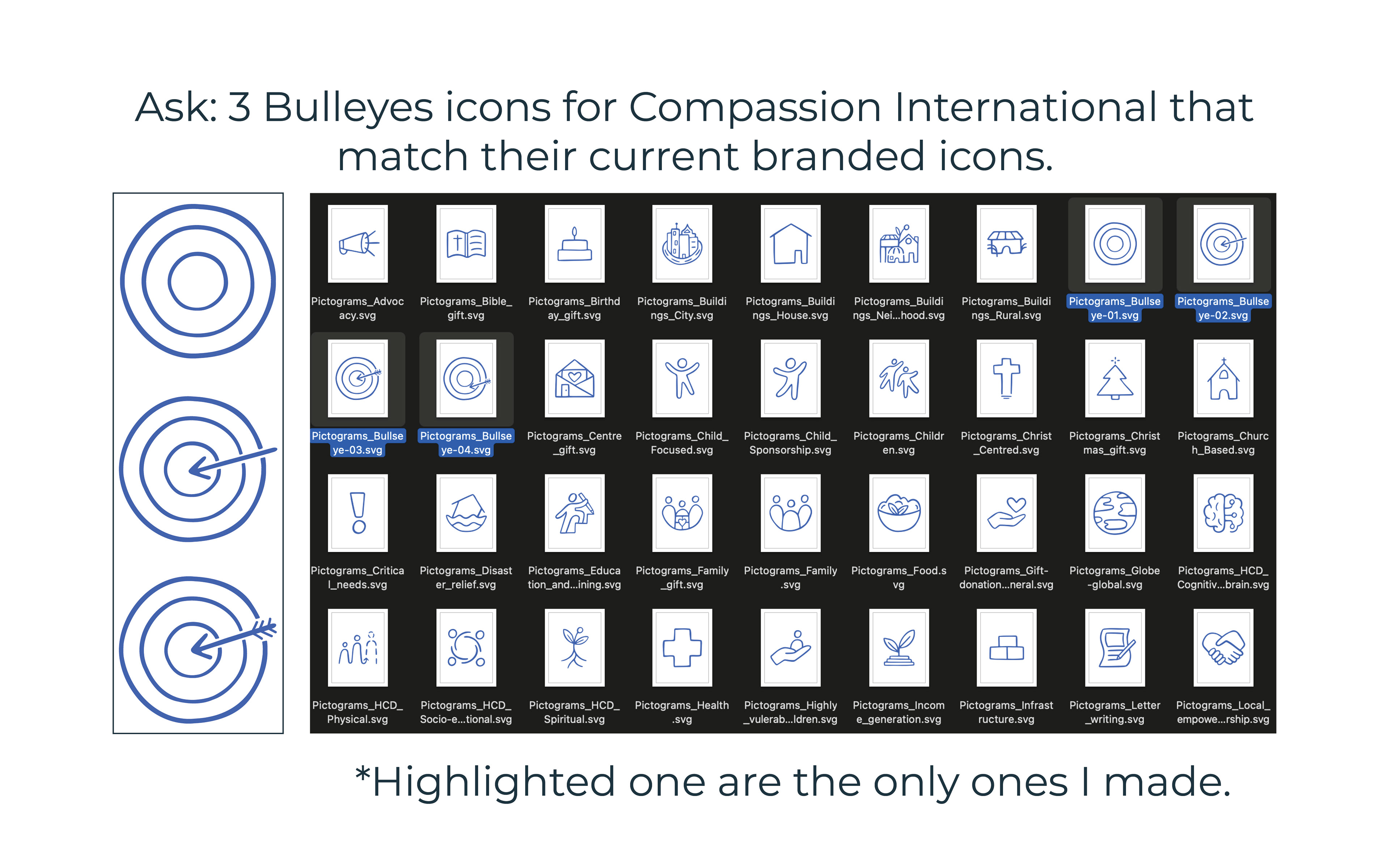
Icons for Compassion International
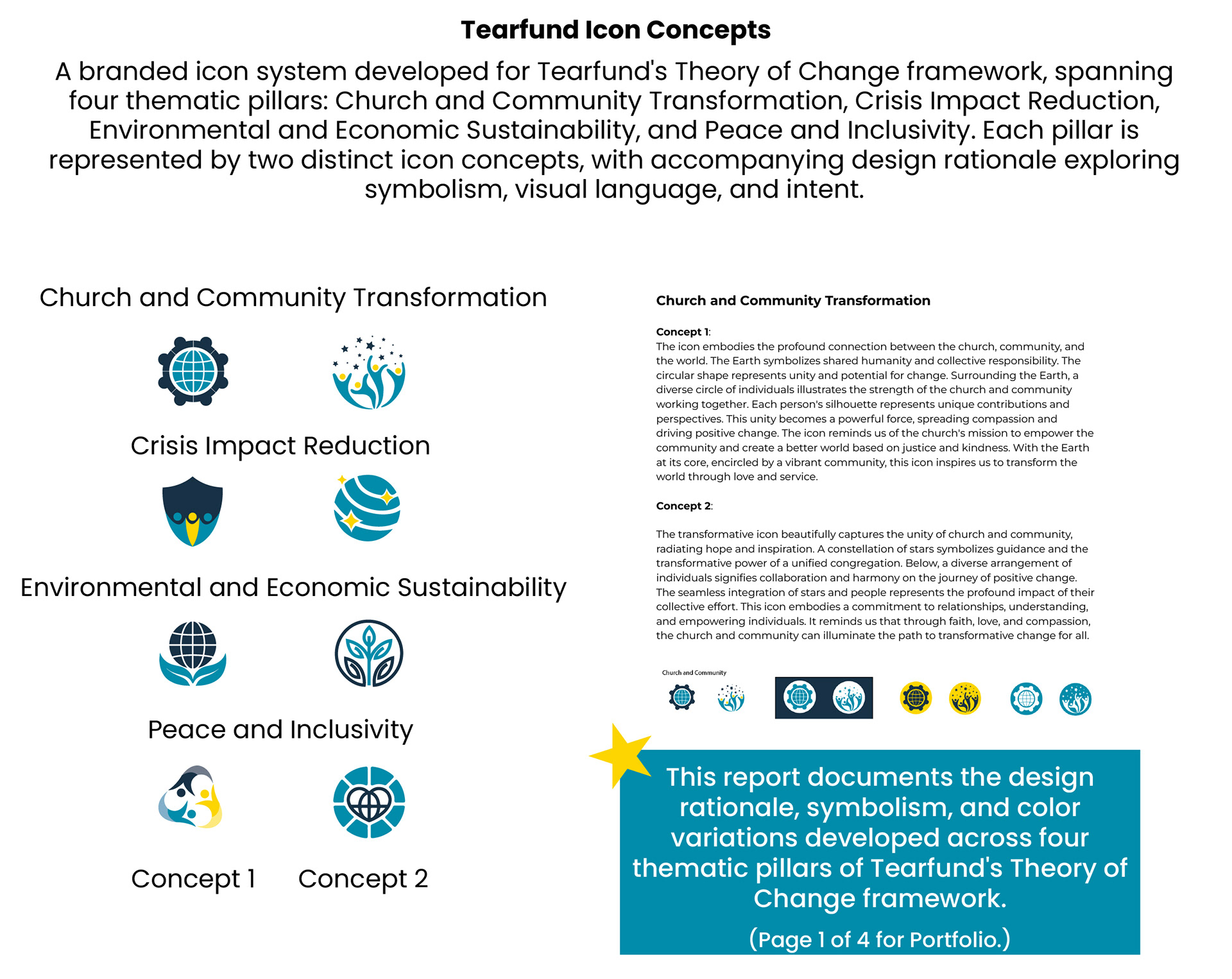
Tearfund Icon Concepts
Brand Identity Systems
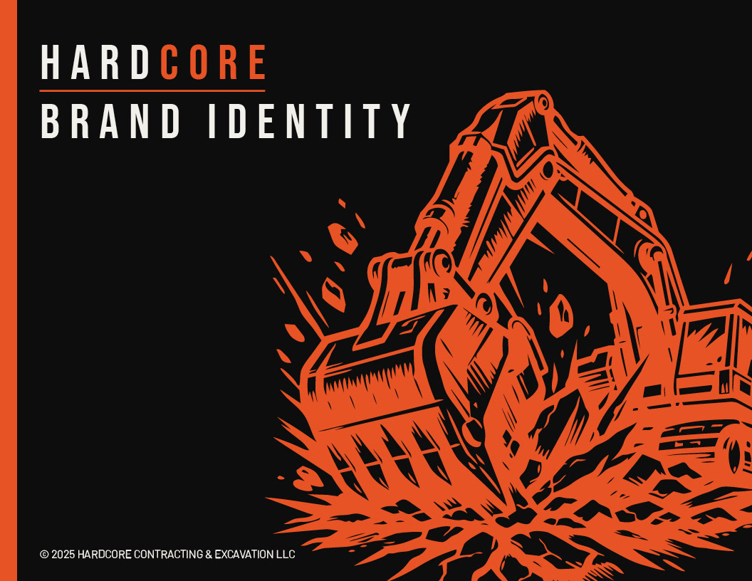
HardCore Contracting & Excavation, LLC
A startup excavation contractor came in with an AI-generated logo, a rough concept, and a name that did all the heavy lifting. They left with a complete brand identity built to work on truck doors, hard hats, bid documents, and billboards.
Brand Case Studies
FULL CASE STUDY
Hardcore Contracting & Excavation LLC
Brand Identity System — Logo, Typography, Color, Voice & Tone, Graphic System, Brand Standards
Hardcore Contracting & Excavation LLC
Brand Identity System — Logo, Typography, Color, Voice & Tone, Graphic System, Brand Standards
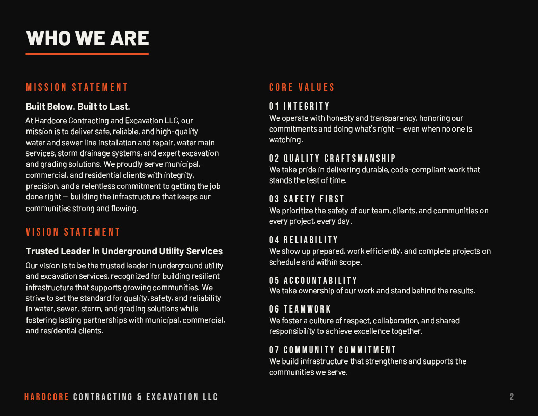
THE BRIEF
The client had a name, a vision, and an AI-generated logo that wasn't getting the job done. The original concept: an excavator with an aggressive face chomping into the ground, debris flying. The instinct was right — edgy, industrial, memorable. The execution wasn't there yet.
The client had a name, a vision, and an AI-generated logo that wasn't getting the job done. The original concept: an excavator with an aggressive face chomping into the ground, debris flying. The instinct was right — edgy, industrial, memorable. The execution wasn't there yet.
They needed a brand that could hold its own on a job site and in a municipal bid packet. Professional enough to win contracts. Distinct enough to own the market.
THE CHALLENGE
Construction branding defaults to the same three moves: navy blue, a hard hat icon, and a tagline about quality you can trust. The name Hardcore permitted us to do something different, but "edgy" without craft just looks unprofessional. The line between bold and cheap is a thin one, especially in a trade industry where credibility is the product.
Construction branding defaults to the same three moves: navy blue, a hard hat icon, and a tagline about quality you can trust. The name Hardcore permitted us to do something different, but "edgy" without craft just looks unprofessional. The line between bold and cheap is a thin one, especially in a trade industry where credibility is the product.
The client came in with strong instincts and zero parameters. That is both the best and hardest kind of brief to work with.
THE PROCESS
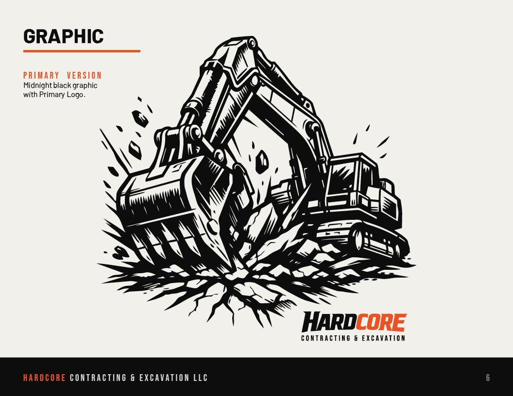
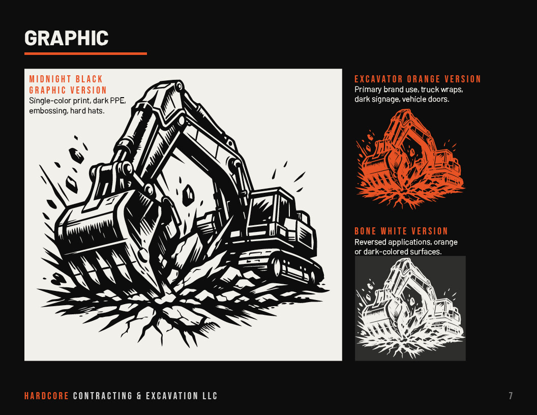
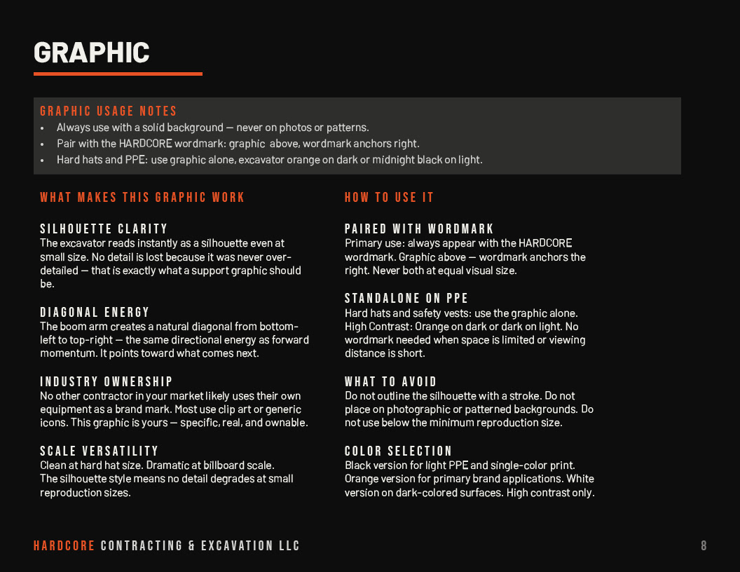
The first conversation was about talking them off the literal face of the excavator. Not because the idea was wrong — the energy behind it was exactly right — but because a cartoon mascot would have dated the brand and undercut the professionalism they needed to win municipal contracts. I redirected that same aggressive energy into the graphic system instead: an excavator mid-dig, boom arm cutting a hard diagonal, debris breaking outward. Same force. No gimmick.
The first conversation was about talking them off the literal face of the excavator. Not because the idea was wrong — the energy behind it was exactly right — but because a cartoon mascot would have dated the brand and undercut the professionalism they needed to win municipal contracts. I redirected that same aggressive energy into the graphic system instead: an excavator mid-dig, boom arm cutting a hard diagonal, debris breaking outward. Same force. No gimmick.
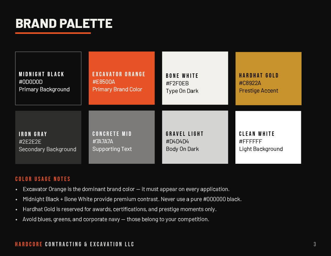
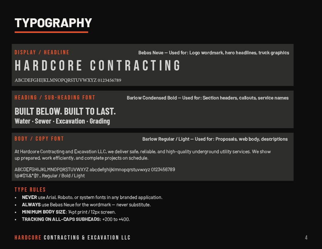
From there, every decision was made to reinforce two things: industry authority and visual ownership. Excavator Orange is the dominant brand color because it belongs on the equipment, the hard hat, and the job site — and because every competitor in their market was using corporate navy. Bebas Neue for the wordmark because it reads at truck-door scale and holds its weight against the boldness of the name. Barlow Condensed for subheads and body because it bridges the gap between industrial and legible across print and screen.
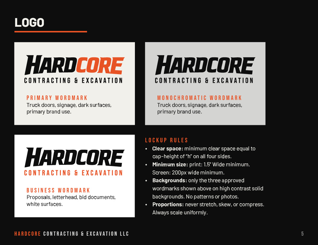
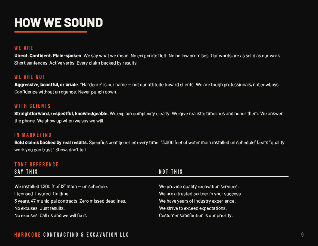
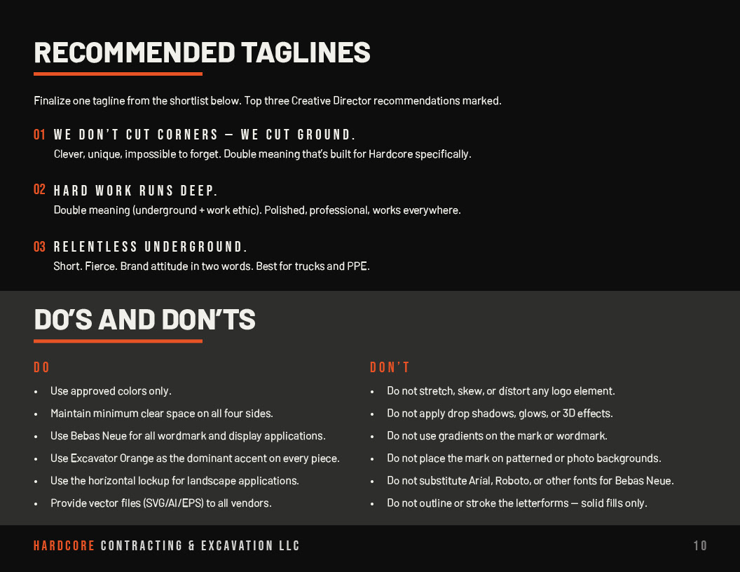
The brand book delivered to the client covers the full system: primary and alternate logo lockups, color palette with usage rules, typography hierarchy with type rules, graphic system with three color versions, and application guidance, voice and tone with a Say This / Not This reference, recommended taglines with rationale, and a complete do's and don'ts page.
THE RESULT
The client approved the full brand system on the first presentation. No revision rounds. The brand book gave them everything they needed to take the identity to vendors, printers, and wrap installers independently — without a designer in the room on every application. I was hired to continue contract work for business cards, web design, annual report, and brochures.
The client approved the full brand system on the first presentation. No revision rounds. The brand book gave them everything they needed to take the identity to vendors, printers, and wrap installers independently — without a designer in the room on every application. I was hired to continue contract work for business cards, web design, annual report, and brochures.
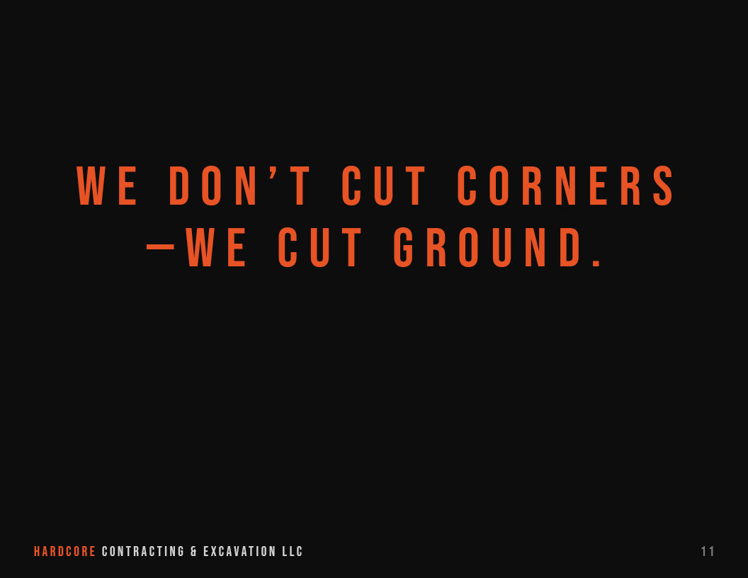
The tagline recommendation: We Don't Cut Corners — We Cut Ground. A line built specifically for this brand, not adaptable to anyone else in the market.
WHAT THIS PROJECT DEMONSTRATES
A full brand identity engagement from concept through standards documentation. The ability to redirect a client brief toward a stronger solution without losing the energy they came in with. Brand voice and tone development for a trade industry client. Print and environmental design thinking across truck wraps, PPE, signage, and bid documents. Delivering a system that works without ongoing designer support.
A full brand identity engagement from concept through standards documentation. The ability to redirect a client brief toward a stronger solution without losing the energy they came in with. Brand voice and tone development for a trade industry client. Print and environmental design thinking across truck wraps, PPE, signage, and bid documents. Delivering a system that works without ongoing designer support.
Tools: Adobe Illustrator · InDesign · Photoshop · Brand strategy · Voice & tone development
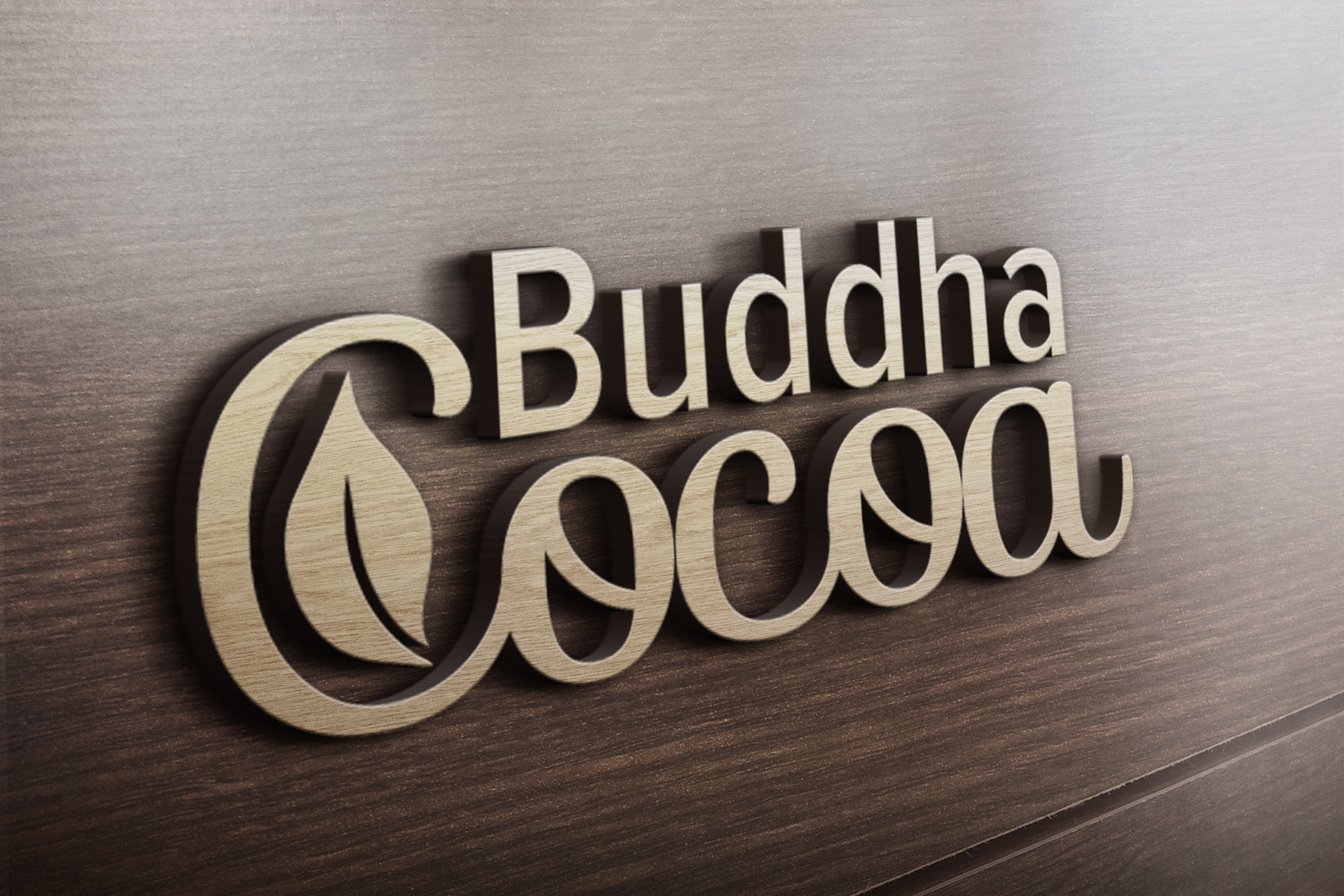
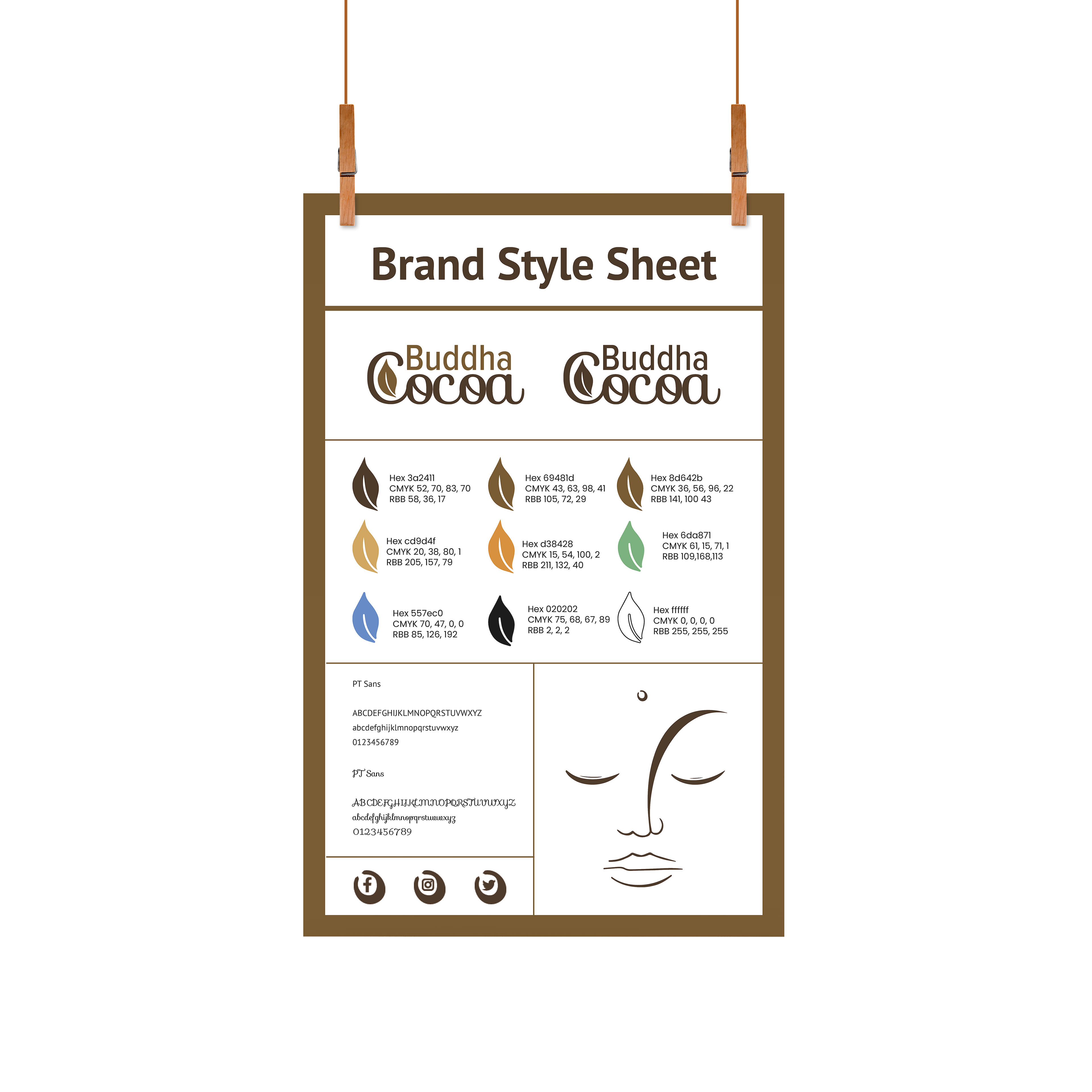
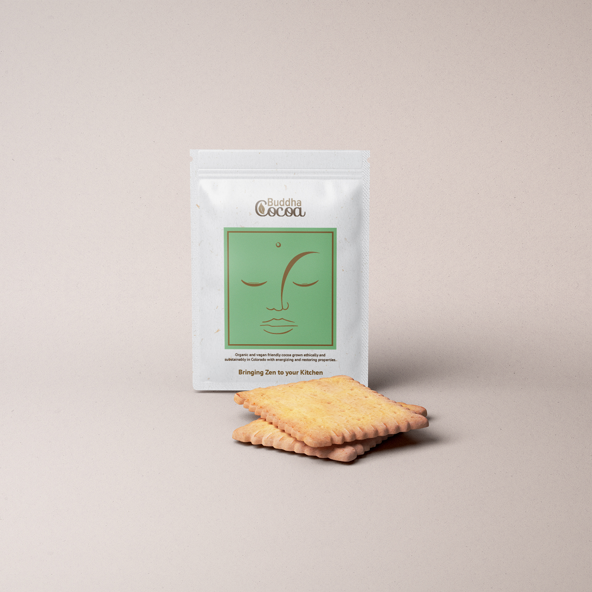
Buddha Cocoa
Brand Identity & Packaging Design
Buddha Cocoa is a vegan hot cocoa brand competing in a market crowded with rustic farmhouse aesthetics and bold health claims. The challenge was to stand apart — to feel warm without feeling dated, minimal without feeling cold, and premium without pricing out the audience the brand was actually speaking to.
I developed the complete brand identity from the ground up: logo design, brand color system, typography, visual language, and packaging. Every decision was made to hold two things in tension — the ritual comfort of a warm drink and the calm clarity of a mindful lifestyle brand. Nothing fussy. Nothing loud. Just a brand that felt like the product tasted.
The work earned an American Advertising Award for brand excellence.
Services Delivered: Logo Design · Brand Color System · Typography · Visual Identity · Packaging Design · Brand Style Sheet
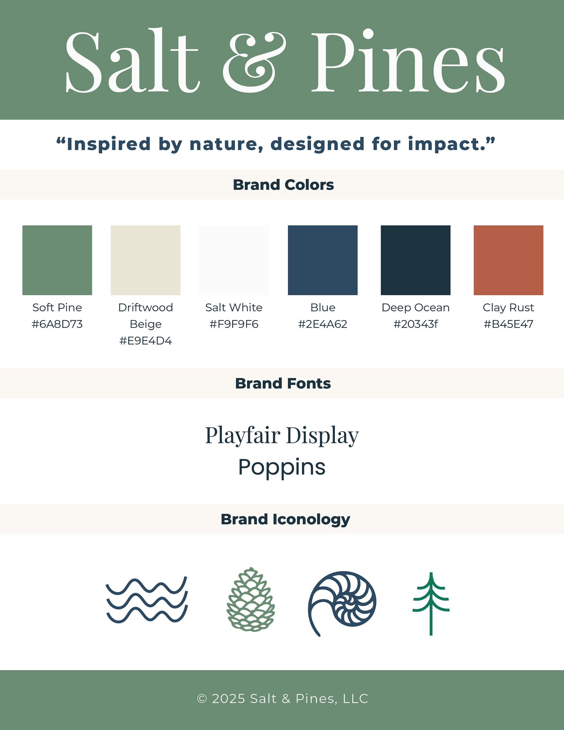
Salt & Pines
Studio Brand Identity
Salt & Pines started as Roberson Designs. The rebrand wasn't a cosmetic update — it was an honest one.
The name comes from two places that shaped how I see and work: the Gulf of Mexico, where I grew up reading light on water, and the mountains of Colorado, where I landed and found a different kind of stillness. Salt and pines. Coast and elevation. The tension between those two things is where the creative practice lives.
The visual identity reflects that same balance: natural, grounded, and designed to hold up across design, illustration, and photography without any one discipline overpowering the others. Playfair Display for warmth and editorial weight. Poppins for clarity and accessibility. A palette built from the landscapes that named the studio — Soft Pine, Driftwood Beige, Deep Ocean, Clay Rust.
Every client project that comes through Salt & Pines gets the same thing this brand did: a clear point of view, an honest brief, and design that means something specific rather than something general.
Inspired by nature. Designed for impact.
Services Delivered: Brand Strategy · Logo Design · Color System · Typography · Brand Iconography · Visual Identity System